This week, I have a special treat courtesy of my friend Molly: a review on the new Senjougahara Hitagi figure! Nope, not that Hitagi figure, but the Kotobukiya version that seems to have been booted far from the spotlight by its Good Smile Company counterpart. Disappointed? Well, you shouldn’t be, as the figure is no slouch against its intimidating competition.
In case you’ve been living underneath a lock this past year, Senjougahara Hitagi is one of the protagonists of Bakemonogatari, an anime adaption of Nisio Isin’s light novel of the same name. Thought she may not look exceedingly special on the outside, Hitagi has a razor-sharp tongue which she uses to frequently verbally abuse and tease the hapless vampire protagonist, Araragi Koyomi. After helping Hitagi in ridding the crab oddity that causes her strange weightless condition, Araragi becomes closer to Hitagi, eventually entering a romantic relationship with her. Not that the abuse ever stops, of course.
Despite being a labelled as tsundere by Oshino, Hitagi is a rather unique character. Her brand of verbal abuse is different from the usual angry shrieks that we’ve heard from tsundere characters all over the place. If the tongue of a regular tsundere is a machine gun, then Hitagi’s tongue would be a sniper rifle – calculated and precise in its ability to reduce a man to a worm. But while her abusive tendencies may seem similar to sadist characters like Maria from Arakawa under the Bridge, Hitagi also displays moments of genuine affection that few could resist. By combining traits from various character archetypes, along with SHAFT-tier fanservice and a good backstory, the sudden boom of Hitagi figures should come to the surprise of no one.
In this review, I’ll do my best to judge the figure for what it is, rather than compare it against GSC and ALTER‘s unreleased counterparts, since comparing a real product against display prototypes is kind of unfair. I will scribble a couple of things down on that subject in the end, so without further ado, let’s a-go!
First Impressions

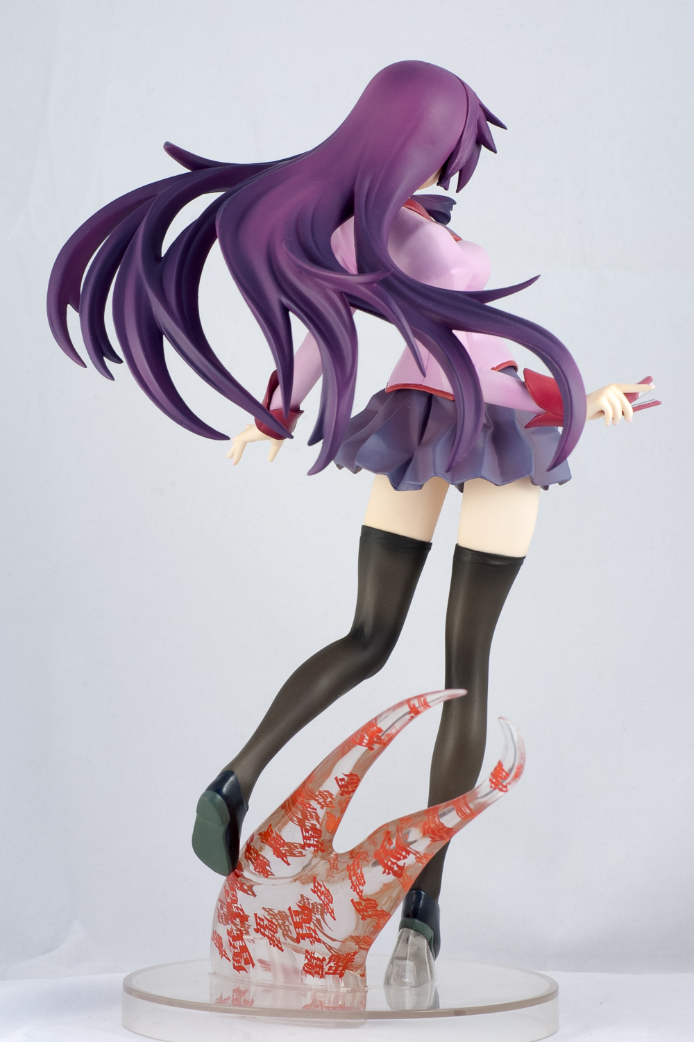
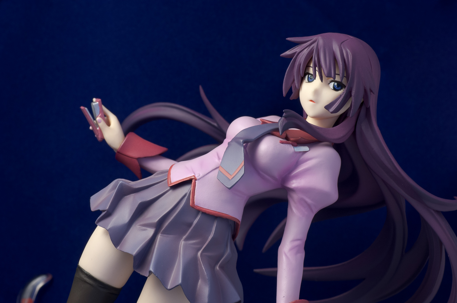
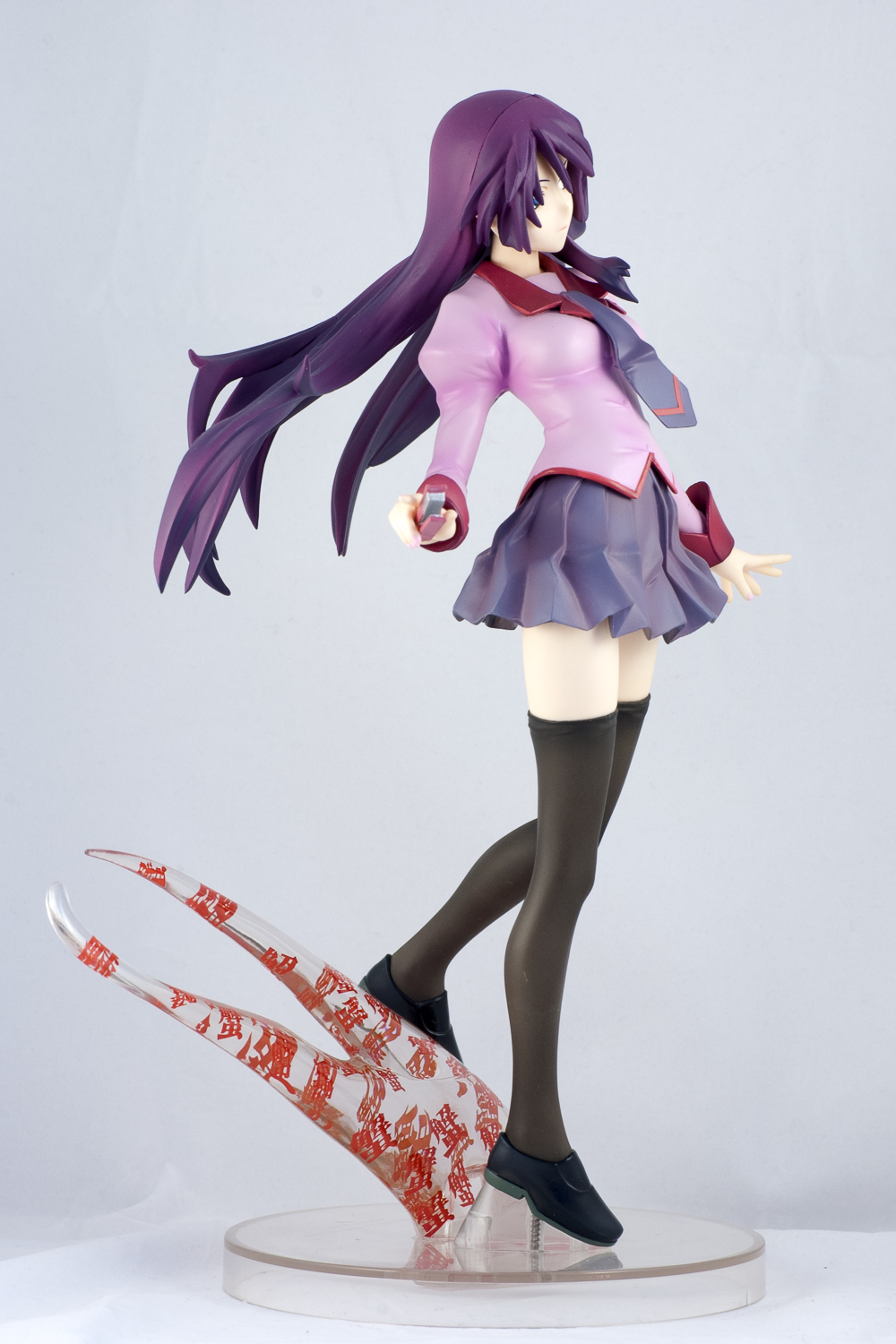
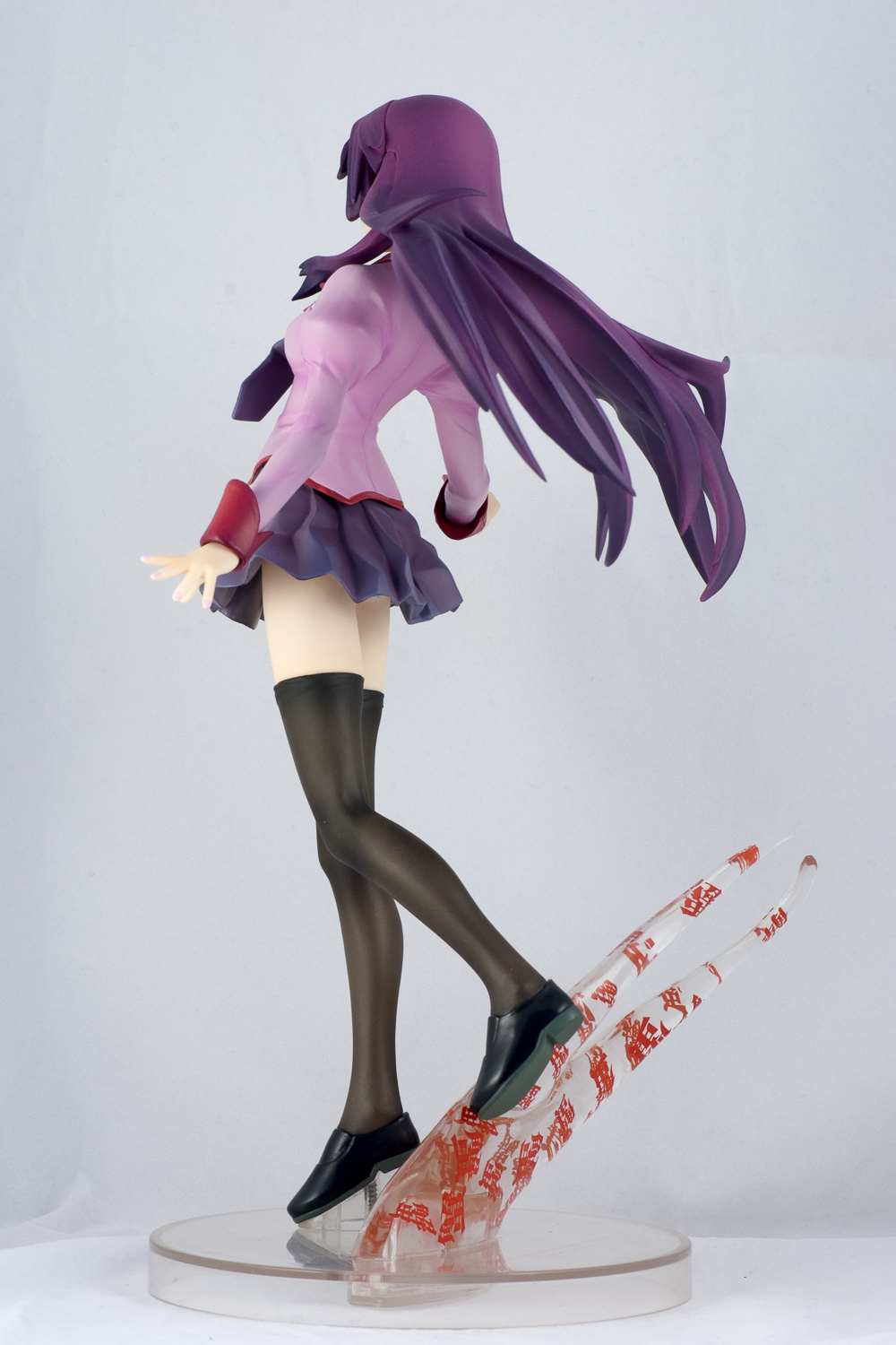
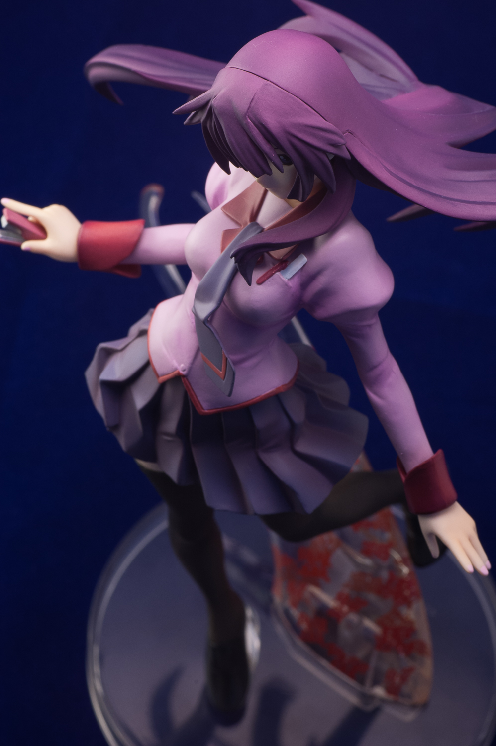
The very first thing that came to mind when I first laid my eyes on Kotobukiya’s Senjougahara Hitagi was her size. Measuring at 21 cm (8 in) tall, Hitagi dwarves the GSC Vocaloid trio (the tallest of which being Miku, who is 18 cm (7.1 in) tall). If translated to 1/1 scale, Senjougahara would be 168 cm (5 ft 6 in) tall, which is noticeably taller than the average adult female height in Japan (158 cm/5 ft 2 in). This can mean two things: either Hitagi is a really tall high schooler, or Kotobukiya is surprisingly generous in terms of scaling. Whatever the case may be, Senjougahara feels pleasantly large due to her long legs, toe-tipping pose, and her voluminous purple hair.
Hitagi’s face is hard to describe. Unlike the GSC version, the face on the Kotobokiya version does not capture the flirty side of her character. The face does not possess a strong sense of emotion, yet I can’t call it “blank” either. If anyone’s got a better way to describe her face, feel free to share. All I know is that her head has a dainty feel to it in its slight tilt and sideway gaze, and I like it.
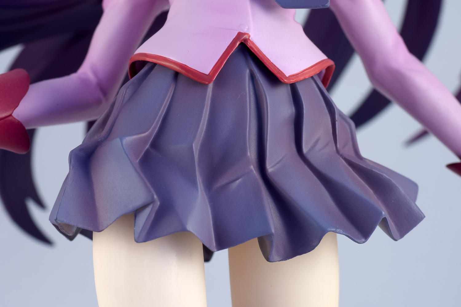
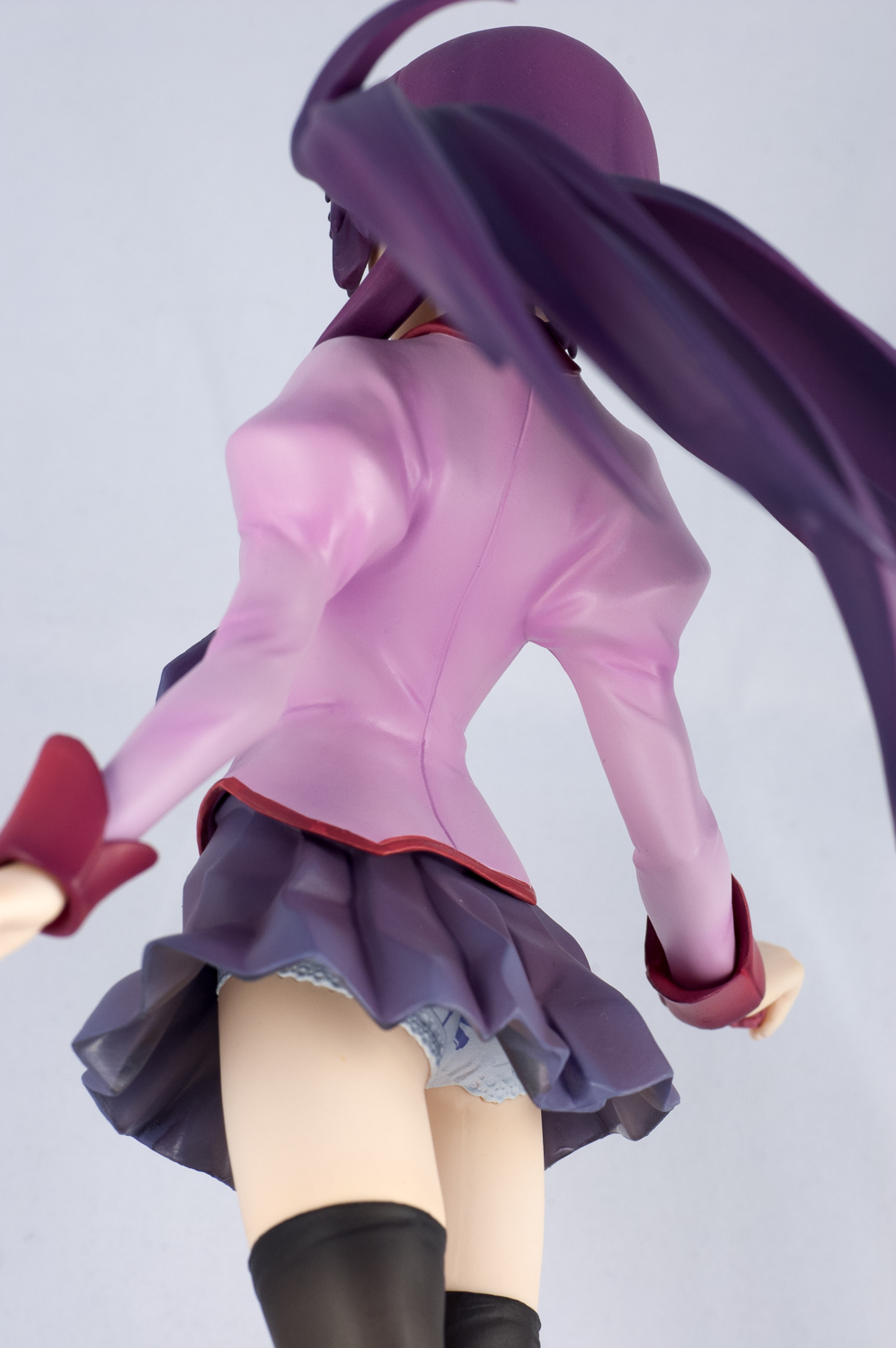
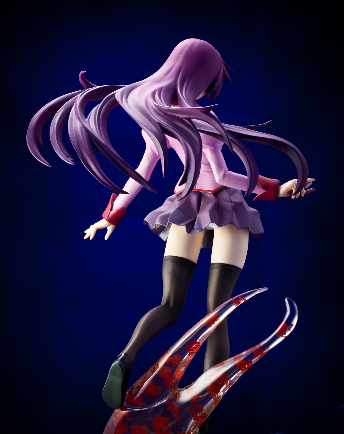
Hitagi’s oddity lies in her weightlessness caused by a crab oddity, and Kotobukiya captures this trait very well. Not only did they include a clear kanji-ridden crab pincer that is inserted into the clear display base, sculptor Shiketaudonko have also created the illusion of weightlessness in the folds of her skirt and tie. These subtle details on clothing physics make it seem that during her fall, Hitagi’s body weight is not so different from the weight of her clothes, thus creating an almost low-gravity snapshot of the character. Her head of flowing purple hair spread out behind her completes the illusion, and a great-looking illusion it is!
Closer Look
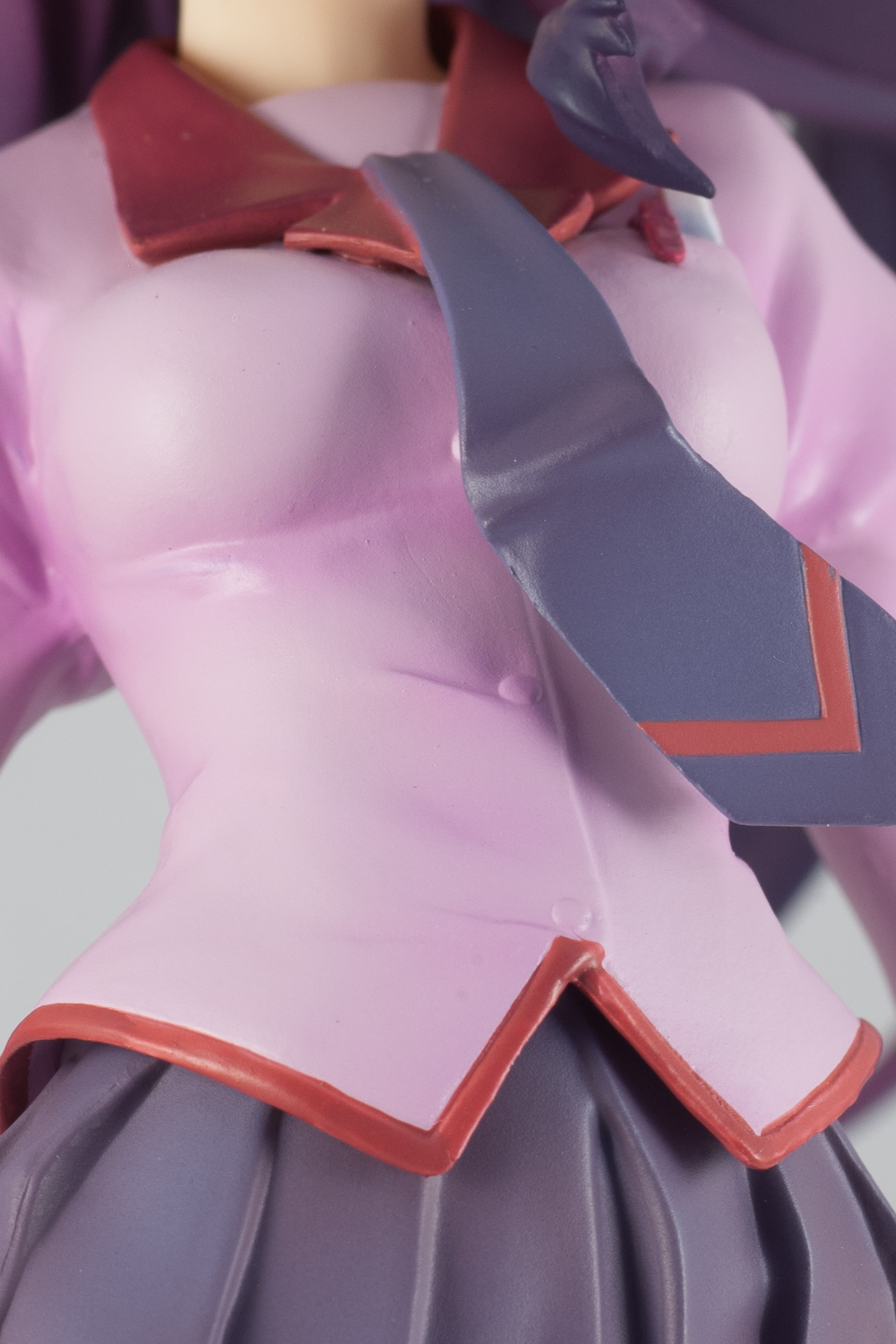
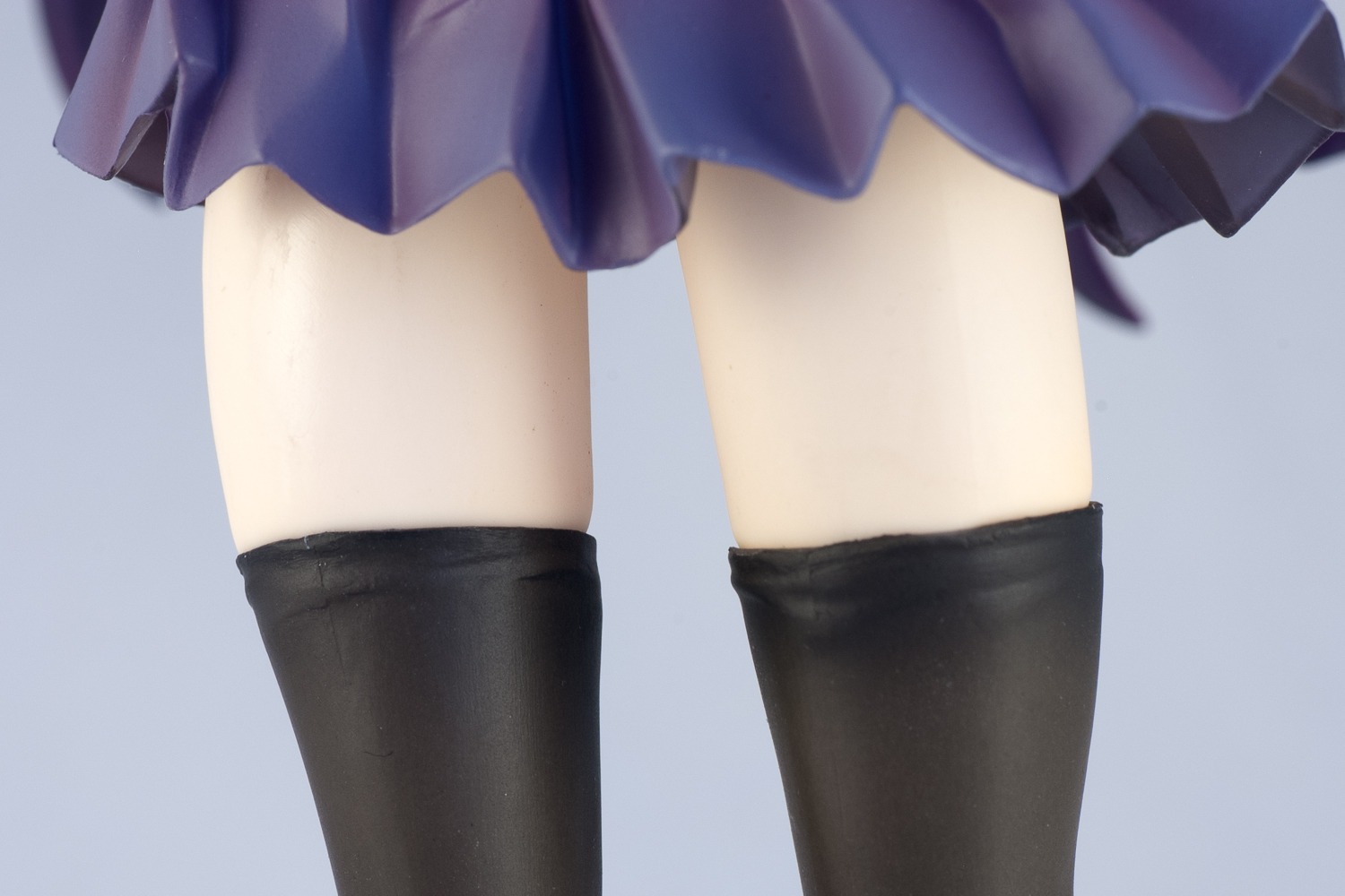
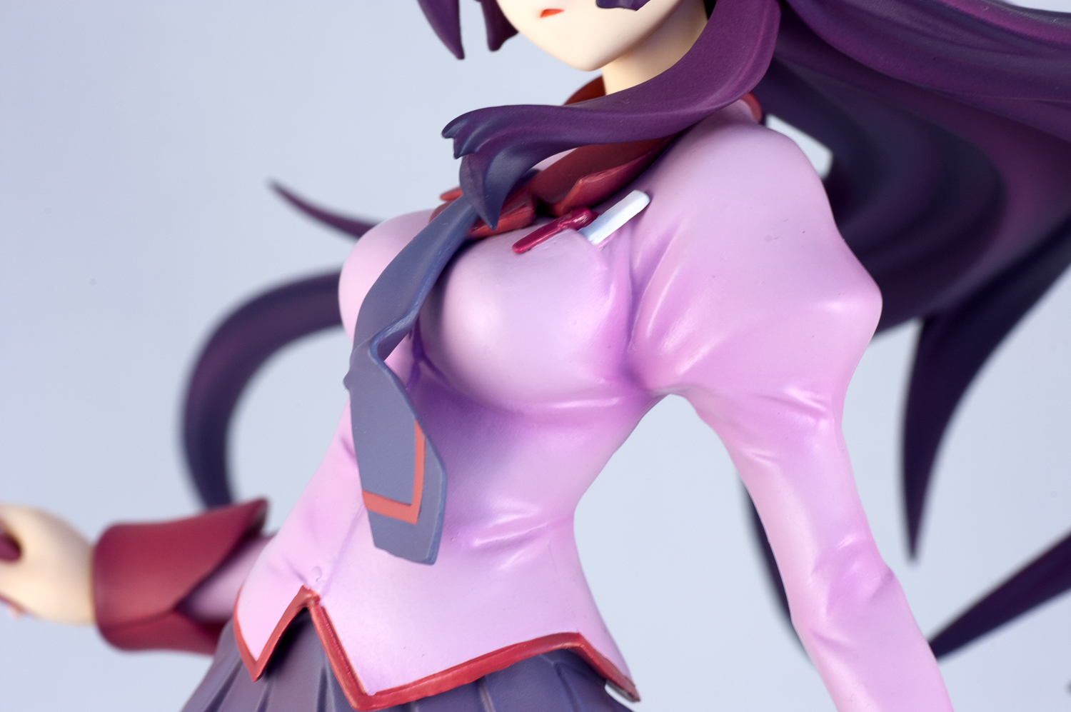
Though Hitagi’s school uniform is of a relatively simple design, Kotobukiya has done a good job with adding depth to her look by using highlights and shading on her top, skirt, and thigh-high socks. The buttons on her top are painted in the same colour as the rest of her top, but this is trait inherited from her original character design. Also deserving of mention are the rims of her socks, which actually have little wrinkles moulded into it.
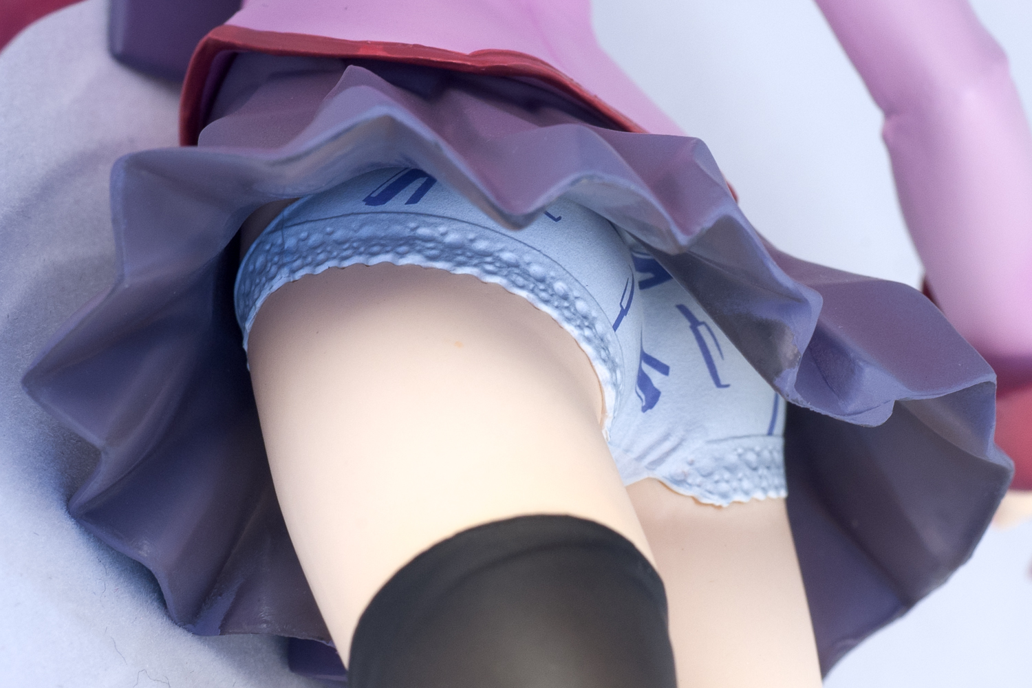
True to her infamous dressing scene, her panties have light blue stationary prints on it. I had completely forgotten about the stationary prints before the review. Needless to say, this was a very pleasant surprise to me.
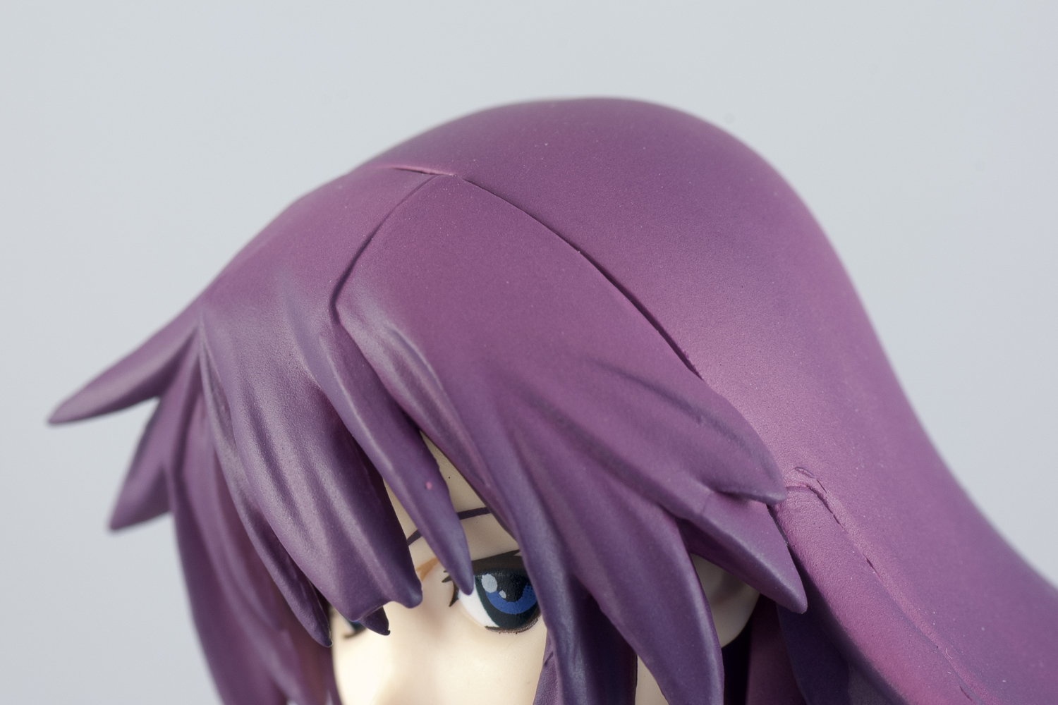
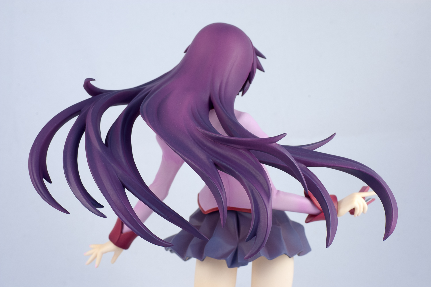
Like her outfit, Hitagi’s hair is also well-shaded. The details of the sculpt are also decent – the points on it are not as sharp as most ALTER and Max Factory figures, but they aren’t too dull either. However, Hitagi’s hair suffers from an excess of part divisions. While the horizontal division on top of her head is a flaw that is to be expected from figures in general, the various other divisions aren’t. There is a line running down the front of her bangs, another on her left side, and yet another on the back side of her hair. The latter two seem to be the result of tacking on extra locks of hair. Since I’m not in the figure-making business, I don’t know why Kotobukiya saw fit to make these extra divisions. What I do know is they unfortunately detract slightly from the overall appearance of the figure.
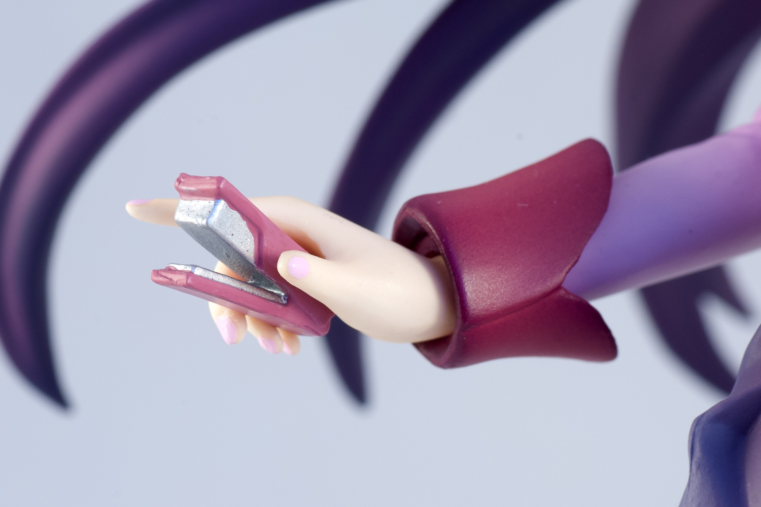
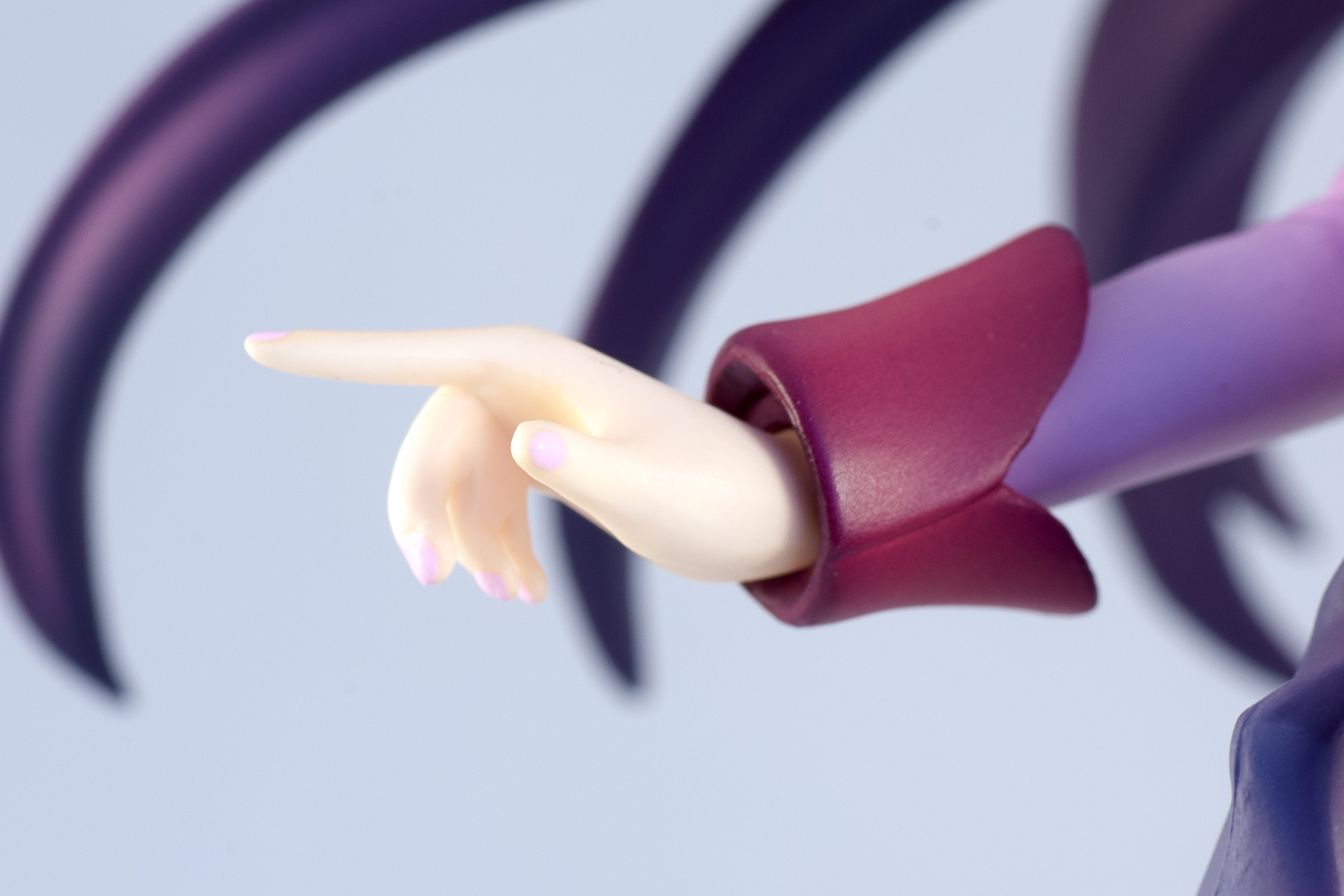
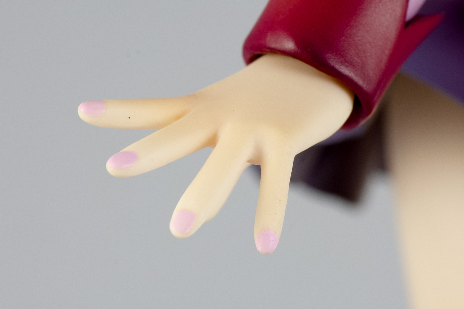
Hitagi is equipped with her weapon of choice – a small stapler that fits snugly in her right hand. Because of its small size, Hitagi doesn’t look too bad without it, either. Her light pink fingernails do not deviate far from the pale colour of her fingers, but you’ll find that they are cleanly painted if you squint at her fingers.
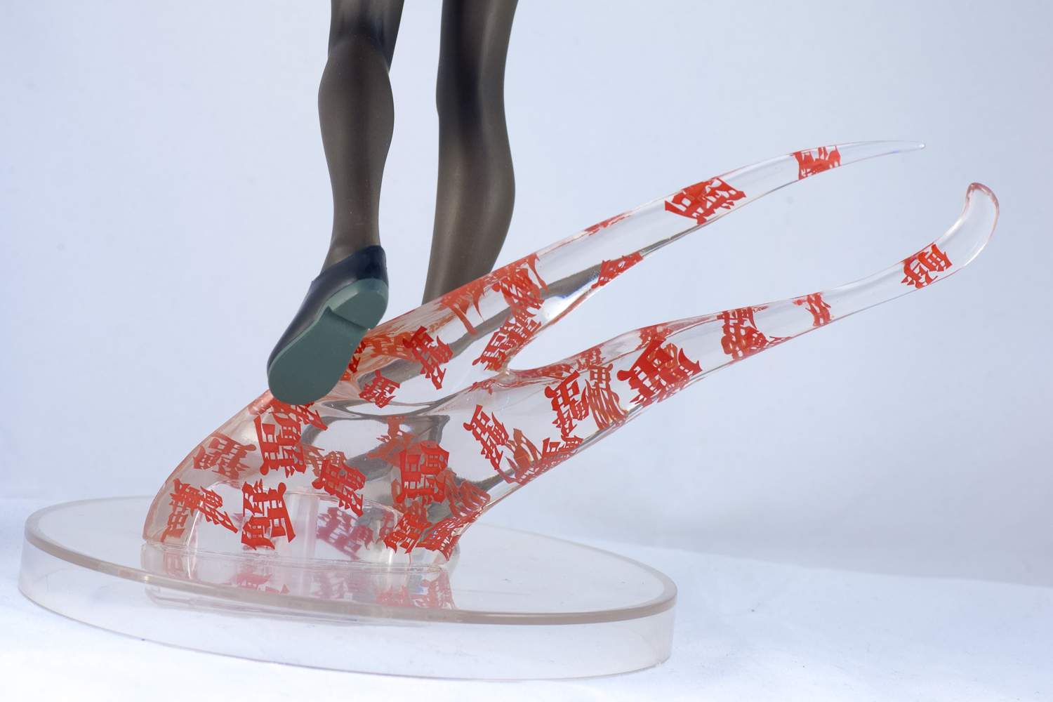

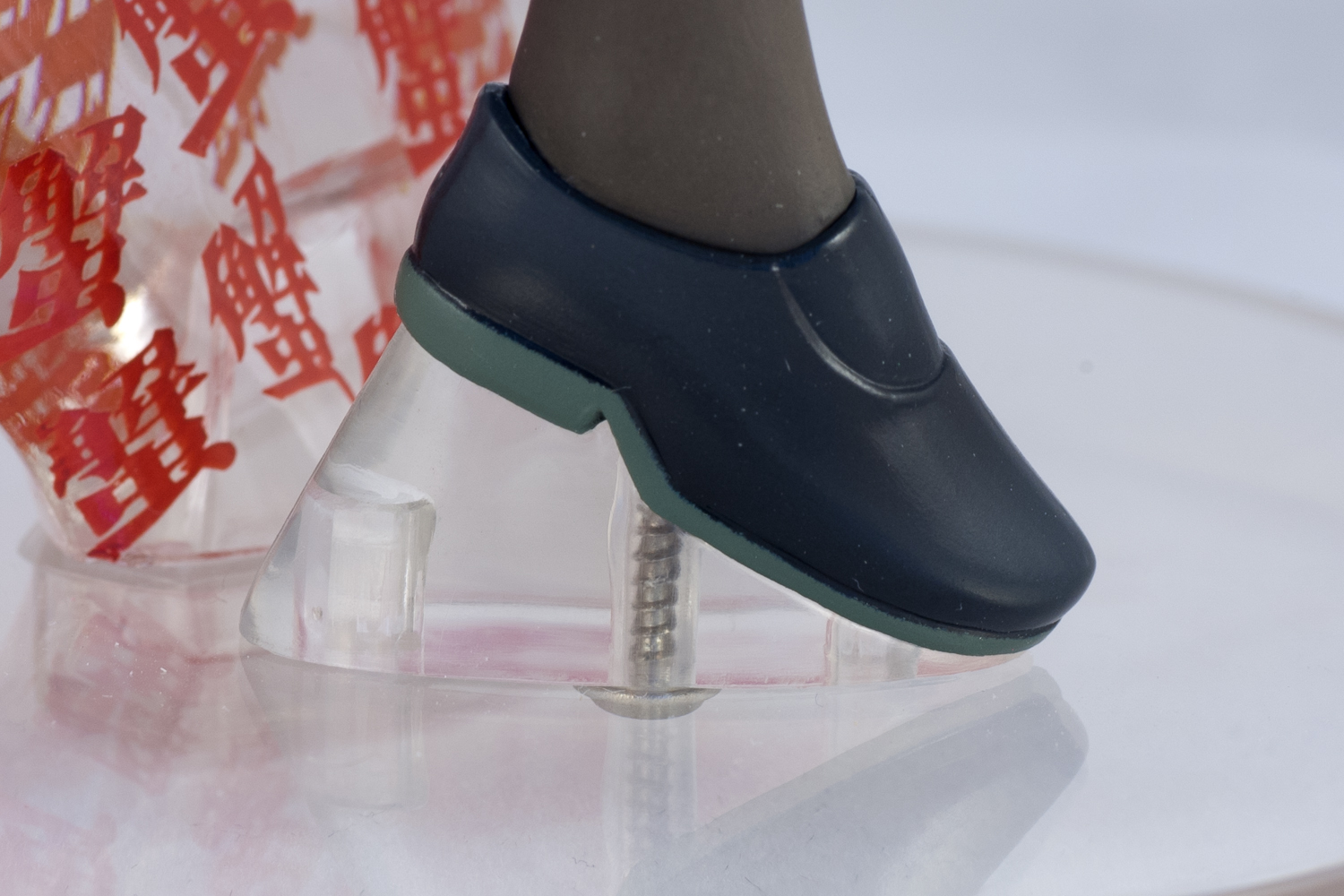
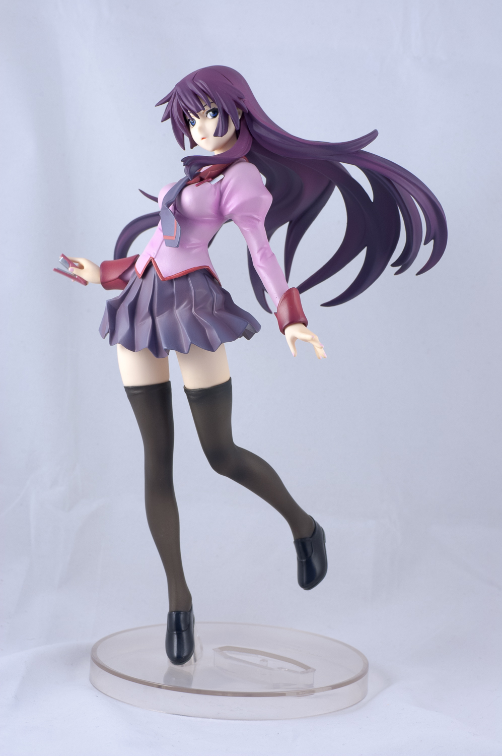
Her right foot is screwed into the clear display base, and the screw is visible through the clear plastic. It’s not a big deal, since it’s pretty inconspicuous. The crab pincer can be removed from the display base, though the exposed socket it fits into would make for a slightly distracting sight. The pincer has a pretty visible mould line running down its center, but I’m not sure if that could be helped. Regardless, this flaw is also inconspicuous enough for me to have wondered whether I should mention it in the review or not. Oh well, better safe than sorry~
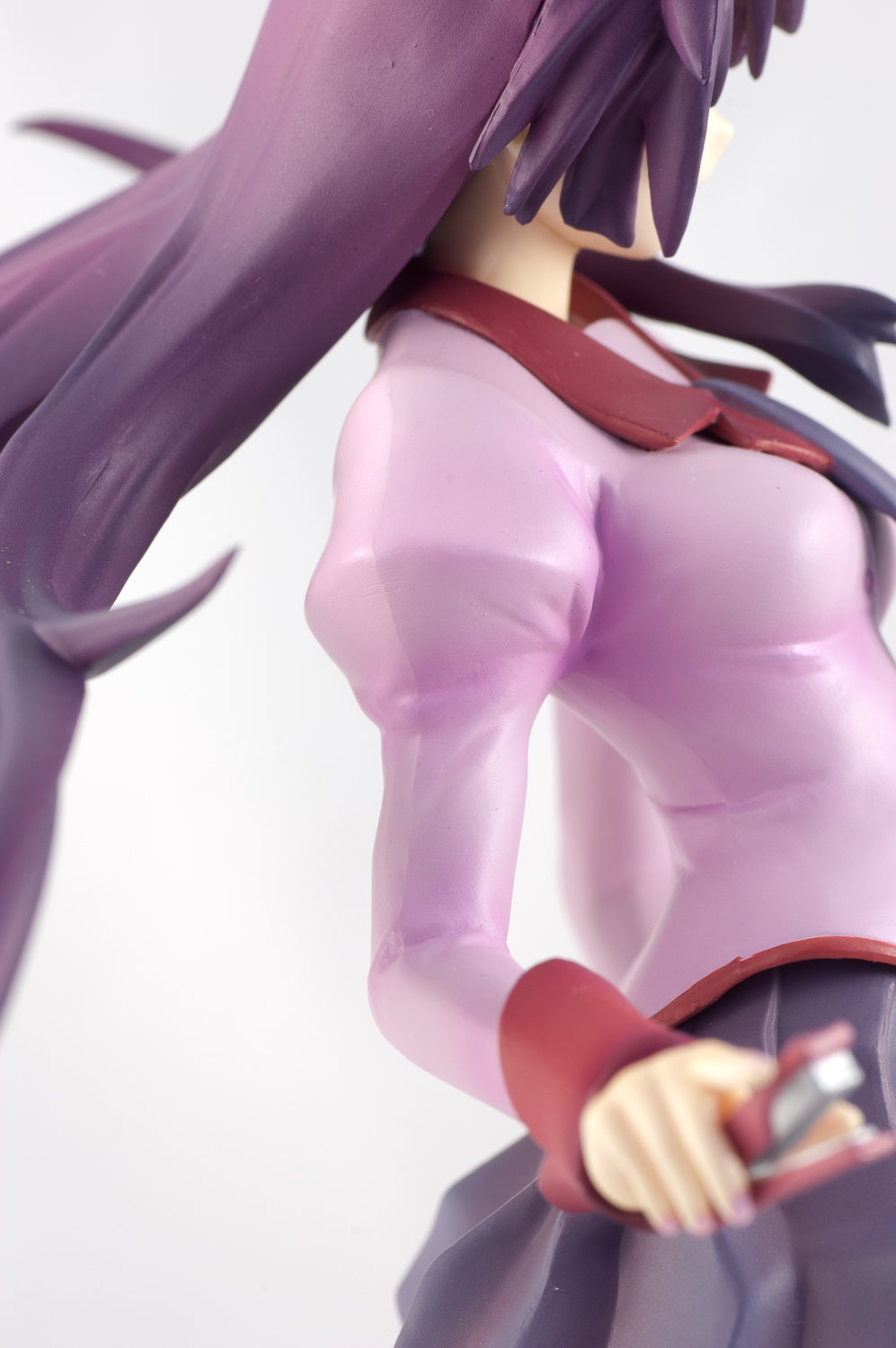
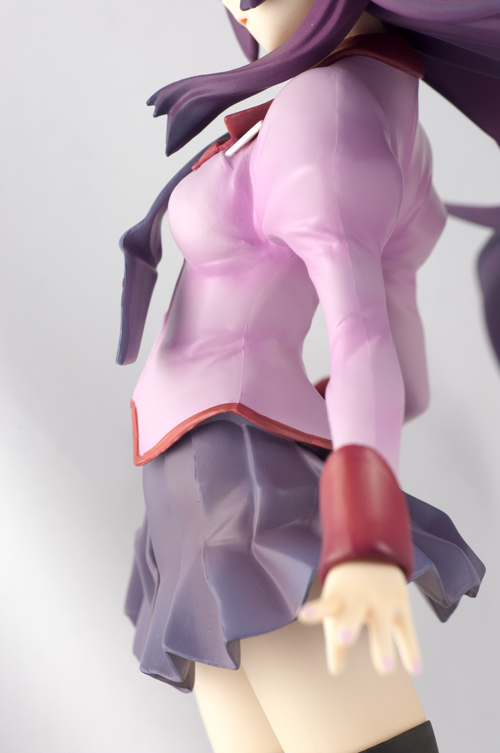
Finally, I have a couple of general thoughts on the production quality of the Kotobukiya Hitagi. There are some mould lines on the sides of her top and the front and back of her legs. While the latter is hard to spot without looking closely at it under direct lighting, the lines on her top are a bit of a shame.
However, the bigger problem I have against the figure is its plastic sheen. The way light bounces off the figure gives it a cheap feel. Her top and skirt suffer from the flaw, but the most heavily-hit part of the figure is her skin. The picture above shows the difference between the Kotobukiya Hitagi and the GSC Kagamine Rin under a desk lamp. The implications of this flaw may differ – if you display her on an ordinary setting, I doubt the sheen is going to bother you terribly much – hell, you might not even notice it. However, if you have a dedicated display cabinet with lights coming down on the figure, I would imagine the sheen would become a significant problem.
Final Say
I’ve managed to dodge the comparison with the Good Smile Company and ALTER versions thus far in order to give figure the fairest opinion I could muster. Now that is out of the way, let’s get to the 9800 yen question, because chances are it is the most relevant question for someone contemplating the purchase of this figure.
Each of the three figures has their own unique virtues. The Kotobukiya version delivers a decent quality figure that does a great job at capturing Hitagi’s weightless oddity while being 2600 yen cheaper than the GSC version. The GSC version captures the teasing side of Hitagi’s personality, and the raining stationary effect looks very impressive. And while it’s probably a little early to judge ALTER’s offering, the promise of ALTER quality along with the big stationary-laden display base is compelling, not to mention the fact that Hitagi is practically squeezing her chest together in that pose.
So, with this in mind, should you get the Kotobukiya Senjougahara Hitagi figure? That depends. There is no question that the figure itself is pretty nice even with its minor flaws, so if you are a Hitagi fanatic with money to burn, by all means snatch up this figure. However, if you’re looking for the one Hitagi figure (TO RULE THEM ALL… sorry, I couldn’t resist), it would be impossible to give you a definitive answer – you’ll have to weigh your own options and decide for yourself, though I honestly don’t see a “wrong” option here. Personally, if I was a little more invested in the character, I’d wait and see a coloured prototype of ALTER’s version before making a decision, since they’ve proven themselves to be a consistent and capable maker countless times in the past. Of course, it may very well be too late to snatch up the other version at that point…
On a side note: I am kind of annoyed that none of the three makers decided to go for Hitagi in the casual black outfit she wore in that superb stargazing episode. The girl is devilishly stylish, and it’s practically a crime to have no figures of her in a ponytail. Pssst Megahouse, I hope you’re listening~
Pros
-
Surprisingly large
-
Weightlessness is captured in the clothing, hair and pose
Cons
-
Plastic Sheen (especially on the skin)
-
Mould lines on the top and legs
-
Excessive hair divisions
Gee, of all the shots I could forget, I forgot to take close-ups of her face… Oh well, there’s a zoom button in the flickr interface – make use of it! =P (EDIT: Fixed for now with a cropped version of an unused photo)
29 replies on “Review: 1/8 Senjougahara Hitagi”
I have found that Koto have always been pretty generous with the size of their figures. It seems to me that GSC is the only manufacturer I can think of right now who skimps out on size (and on occasions quality as well).
I like how you listed out and elaborated on all the flaws present on the figure. This is what a figure review should be like. For someone who is contemplating a purchase of a figure most of the time they don’t need another to tell them all the good things it has and just briefly mention a couple of “small flaws†that one may actually make a big deal out of when receiving the figure. Because chances are, they already see what’s good about the figure since they want to buy it. However, there are cases where there’s no flaws (most of ALTER’s releases for example) to speak of and only the admiration and happiness will show through the review. The neutrality of this review could also be because you are not Hitagi’s biggest fan and that you don’t actually own her. Let’s face it, deep down we’re all fanboys/girls of something and will defend our purchases when we can. Whether you like it or not that and clouded judgement go hand in hand.
Anyhow, what I like about this figure is how the sculptor focused on something different and more subtle than the usual keywords associated with the character, “tsundere†“abundant stationary†are a couple that comes to mind. It gives buyers more choice which is what makes this hobby of ours so good. Nevertheless, typical of Koto their execution falls short and the product delivered is not as enticing as it should have been. The offerings from the other two big companies raise stiff competition due to their generally better finishing of figures. While cost and uniqueness side with Koto’s Hitagi, it probably won’t be enough to persuade potential buyers due to its glaring faults and the existence of superior alternatives.
Haha, I get what you mean when you say that we tend to defend our own purchases. This is especially true for people who get very attached to their figures, because it would be like reviewing their own child (“Well, on the upside, my Billy is a pretty good-looking kid… Too bad he’s as dumb as a doorknob, though.”). For me, I think my saving grace is my love for nit-picking and bitching — I just find it more interesting than writing a textual circle jerk, since chances are that the promo shots have already made clear most/all of the positive points of the figure months before its actual release.
Reviews are opinionated and biased by nature, so I have no right to say that I’m “objective” in my reviews. However, by recording the flaws in a consistent manner, at least I’ll have the facts to fall back on. To me, there are only two reasons for figure reviews to exist: creative photography and being informative, and since I don’t really do my homework on photography, that leaves me with only one choice when it comes to making relevant content, lol.
Anyways, back to the figure: I can’t help but to think that Kotobukiya’s Hitagi would’ve been more successful if their initial promo photos were better. The actual product ended up looking significantly better than the promo shots, which is something that should never happen when first impressions are so crucial to preorder numbers. The colours just aren’t vivid in shot like this.
That picture is actually VERY misleading. The very visible separation lines between the parts for her hair are clearly not present in the promo photos. We’re not talking about a missing accessory or some such, this is an important part of the figure that would scream at the viewer when displayed.
For that, Koto gets -10 points. If not for their rebuild eva line I’d probably rank Koto low on the figure manufacturers tier list (With companies such as Griffon and clayz).
I was about to say you’re being a little harsh on Kotobukiya, but come to think of it, I wouldn’t put Kotobukiya above ALTER, Max Factory, GSC, and Megahouse either, so I suppose their position is pretty from from the top of the list. There’s still a significant gap between Kotobukiya and the rest of the pack, though, especially Griffon — as Ash pointed out in his Claudette review, ALL of their figures’ faces look identical.
Yes Griffon does have the problem of making identical faces. It’s the most pronounced flaw in their figures. However, when you look at Koto you can also pick out many flaws in a lot of their figures too. Skin tone inaccuracies, bad sculpting, dull colours etc.
It is a fair assumption that in general Koto’s figures are more desirable compared to Griffon’s but with the amount of flaws present Koto, they are not much better as a manufacturer IMO.
Chag you fail…That big line about her face and no close-up shots of her head?!? BOOOOO! T_T
Meh if I had to give the expression a label though…Quizzical.
Ah anyway I absolutely love the sculpt and the hair, but like you said the sheen is annoying and I just dislike the paint in general (excluding the hair) so meh Ima wait for Alter…I do really want a casual dress version of her like you mentioned though.
Sad school uniforms are the standard as always…Whats wrong with casual wear?!?
Looks like Hitagi is not the only one here with a harsh tongue. =P I threw in the cropped version of an extra shot, which turns out to be pretty well-focused and good for my purpose. All is well!
I dislike the Bakemonogatari school uniforms in general, actually. They’re too plain for my tastes, and the shoulder poofs look out of- ashion. They remind me of the Utena uniforms, and last time I checked, the 90’s have long passed.
Ah the poofs are obnoxious…If they feel the need to make one with the uniform I wish they’d atleast go with the shoulder rolled up version Hitagi sported in the later half of the show…Now that was a nice way to make the staid old seifuku look fresh!
I know absolutely nothing about Bakemonogatari so thanks for the writeup; I had heard that the series was a little strange, but the plot sounds a lot more out there than I expected it to.
Kotobukiya’s figure is definitely below GSC’s and presumably Alter’s (I think that’s a safe presumption, anyway) in terms of appeal, but being the first to market has a quality all in its own. I’ve bought a few figures simply because they were the earliest available renditions of a character that I liked. Can’t say that I’m a big fan of Hitagi’s character design, though; those colors are so drab, they don’t grab you like, say, the Bible Black school uniforms. Though admittedly, there’s another pair of reasons that those uniforms stand out so strongly.
I guess the first and only word I think of when I see her face is “bemused,” though I don’t know if that qualifies as an emotion.
Ah geez Tier you should watch it…Light on Fanservice sure, but the dialogue is awesome! :p
Walls of text. Literally. Walls of it.
It’s a good series though, I enjoyed all of it.
“Real-life problems with supernatural twists” is how I’d describe the series. No matter how loopy the supernatural elements and fanservice gets, it always grounds itself at the end of every arc, which I liked a lot. It has all the guilty pleasure of your run-of-the-mill harem series without the horrid aftertaste and self-hatred.
You are right: timing is pretty damn important in the figure business. Makes me wonder how much industrial spying goes on between the figure makers. Whatever advantage Kotobukiya had with their earlier release date was pretty much snuffed by GSC’s early revelation of their own Hitagi figure way back when. I can totally see the bitter tears shed over at the Kotobukiya offices. If only spying worked for our advantage… then maybe one of the makers would realize that instead of fighting for the same slice of cake as the other two, the wiser thing to do would be to release a casual outfit version… But alas, we have no such luck.
“Bemused”, eh? DING DING DING, I think we have a winner! Figure blogging has turned out to be an unexpectedly educational experience.
It’s a cool figure i really like the base. But I still prefer the GSC version! ^^
If GSC doesn’t screw up their QC on their Hitagi, I’d place it higher than this as well. Some people seem take issue with the very limited display angle for the GSC figure, though.
The figure look good but the plastic “Wind” looking things is a big turn off.
You mean the crab claw? I like it, though I can also see where you’re coming from. Have you watched Bakemonogatari?
I like the Alter Hitagi sitting on the steps the best. I have not seen much of it, but I like what I have seen so far.
But I love this one too. It’s a close second. Her face is beautiful. And the expression, while blank, suggests that she is measuring up and evaluating whatever or whoever it is she is looking at.
The pose is flowing and dynamic. I especially love her hips area–the width of it and how it twists opposite the torso. And I love how subtly erotic the pose of her legs are and how simple their lines are compared to the complexity of her hair and torso.
The product is not perfect. I agree with the others that the paint job is inferior and the seams in her hair should have been better hidden considering the cost to buy it. I think the Good Smile also has an interesting pose. But her face is weird. The eyes are unflattering and the subtle smile is goofy.
Nice blog, by the way. I think I’ll be visiting here more often in the future.
XD
The face of the GSC Hitagi worries me as well. Ironically, it only looks good when you can’t see much of it. The moment you move away from the 6 o’clock view of the figure, the face either becomes completely obscured or starts to look strange, possibly because when you look at the face head-on, it doesn’t look like the Hitagi in the anime who almost always wears a bemused expression. I don’t think it looks BAD, per say… just alien.
And finally, thanks MogWhistle! I look forward to your future visits =).
Thanks for the welcome, Chag. 😀
I think the problem with the Good Smile is that the sculptor, Hironori Tokunaga, tried to be faithful to a promotional 2D image for the animation, but wasn’t quite able to translate the face to 3D in a satisfactory way.
http://chan.sankakucomplex.com/post/show/567439
From the one perspective, which mimics the drawing, in which you can see Hitagi’s leftside profile looking back over her shoulder, the Good Smile’s face is beautiful and the expression subtle.
http://www.goodsmile.info/cgm/ecommerce/goodsmile/images/large/3ad2b010f87bb6ba591bf006f8b5fb82.jpg
But compared to the drawing, the facial expression on the Good Smile is much less interesting. You can see that the main differences in the 2D and 3D faces are the shapes of the eyes and the fact that the 3D has a much more pronounced “overbite” to accomodate a “longer” nose.
There are cute faces with overbite. But on the Good Smile, the effect of the “overbite” and the angle of her chin is to give her a “weak chin” and tiny “muzzle.”
http://1.bp.blogspot.com/_Rs53-MPsJaI/R7jlVjDspKI/AAAAAAAAFUM/w5ur5CEgHso/s400/thirteen.jpg
The weak chin and muzzle seem to make unflattering curves in the lower part of her face.
http://www.goodsmile.info/cgm/ecommerce/goodsmile/images/large/bd817294e2758cb08137d61b9e551ed2.jpg
And I think the primary casualty of these effects are her lips. To make her lips “match,” the sculptor decided to severely weaken the upper lips but protrude the lower lips excessively. Her lips make her smile look goofy and I find this look unflattering.
http://www.goodsmile.info/cgm/ecommerce/goodsmile/images/large/9f07ce7a611e08ada01dec40e657aee2.jpg
At the same time, I think the eyes make the upper part of her face uninteresting. I find Kotobukiya’s eyes much more interesting than Good Smile’s. I just think the former has better proportions and shape, pardon my lame argument. Also, Good Smile’s eyes suggest sexual invitation, whereas, Kotobukiya’s eyes seem to be searching and measuring. I find the searching, measuring eyes much more interesting than the sexually inviting one–not that I have anything against sexually inviting looks.
^_^;
Oh man, this a a fantastic deconstruction her face! It’s amazing how much you lifted from those few promo shots. Thanks for sharing this here — it really puts my ambiguous uncertainty against the face into organized words. Looks like I have a long way to go… time to take notes.
Thanks for the compliment, Chag. 🙂
I would like to add some more comments about the Kotobukiya and Good Smile.
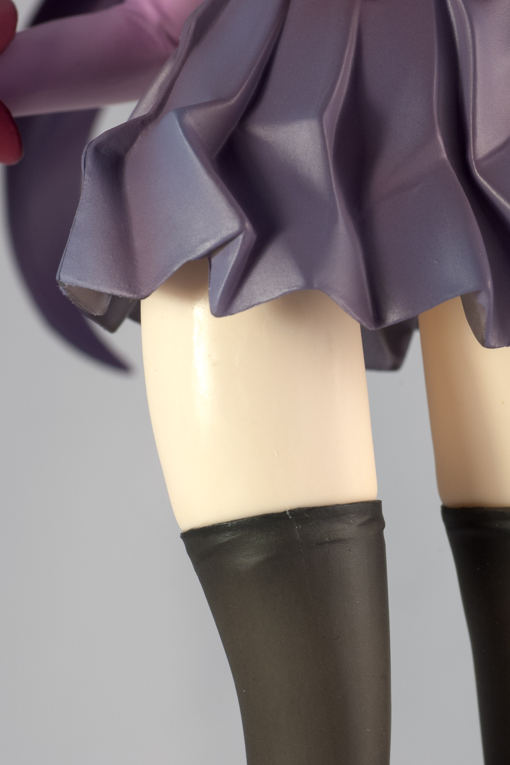
I also think Kotobukiya’s legs are much more sexually appealing than Good Smile’s. The latter has skinny legs. The former has just enough more “meat” on them such that we can see that they are shapelier. Kotobukiya’s leg’s lines are curved in all the right ways.
This angle really shows the appeal of her legs:
http://farm5.static.flickr.com/4096/4870545048_2ea115d6bc_o.jpg
And even though the Good Smile is posed lifting her skirt, the more mature proportions and curves, as well as the overall pose, of the Kotobukiya’s is much more “sexually” appealing.
I think the Kotobukiya sculptor did a tremendous job. I’m really impressed with his skill. He just needs to figure out how to hide the seams better and hook up with a superior painter.
😀
Haha, I’m glad you brought up her thighs, because it’s one of the things I wanted to bring up in the review but later forgotten due to my intent to avoid excessive comparisons between GSC and Kotobukiya in the body of the review. Zettai Ryouki practically demands a pair of formidable thighs, and I find Tokunaga Hironori’s decision to skimp on the thighs puzzling — even the thighs in the original illustration seems to have meatier thighs!
By the way, have you ever considered writing figure reviews? With eyes as sharp as yours, you’d make an amazing figure reviewer — and that’s no flattery, either.
Thanks again for the compliment, Chag.
And thanks for helping me figure out the meaning of zettai ryouki. I didn’t know what that meant. I had been assuming that it meant twin tails. But I guess this just means that a large percentage of twin tailed anime characters prefer thigh length stockings.
:p
When I look at the original drawing, though, Hitagi seems to have pretty skinny legs. ^^;
I guess if someone was looking for a figure reviewer with barely even a rudimentary formal training in the arts, let alone training in sculpting, then I’d try out for a position. Seems like it would be a fun way to make some money on the side. But looking around the net, I don’t see any substantial review sites on anime figures and toys. Your blog seems to offer the most substantial reviews, which is why I think I’d like to visit here more often. This leads me to believe that there is no such position and that you can’t really supplement a meager living by being a reviewer of anime figures. :p
The fact is, I just don’t make enough money to be able to buy enough statue class figures to warrant a review blog. I only buy a few cheap figures, like Figmas. It might be cool if I could establish myself as a noted enough reviewer of figures such that companies would actually loan me figures for review. But the fact is, toys are not like computer components or restaurants. You don’t know how powerful a video card is or how good the chef is by looking at a card or a photo of a meal. But you can tell if you want a toy just by seeing it. There really is no need for a reviewer.
^^;
Haaaa, if only people actually get paid to do this stuff! Figure reviews are mostly acts of self-indulgence, anyways. I’m sure all of us know deep down that what we’re doing is largely pointless, yet regardless of this fact we continue to shoot photos and write because we enjoy the process. To me, reviewing a figure has become an integral part of appreciating the figure, because I get to view the figure from various perspectives in detail during the process of creating the review. It’s kind of like taste wine in your mouth before sending it down the hatch.
Dawww, I’m glad you hold Hobby Hovel in high esteem — thanks again! Check out some of the sites on my blogroll, btw, because there are plenty of substantive figure blogs out there. I highly recommend giving Tentacle Armada, OMGwebsite, Visual Fanfare, and Polyvinyl Crush a look. Not only do they write great reviews, but they are a lot better at taking great photos than I =).
To tell you the truth. I did not intend to buy my Saber Alter Figma. I was satisfied with the blue and Lily. But I got curious about it and yours was the only review that answered most of the questions I had about it. The original, as you noted in your review, has some serious design flaws. Lily was a great improvement. But Lily has a strange aesthetic flaw herself. When you peel up her armored skirt and take a look at her backside, she looks like she doesn’t have any ass. Or as Hank Hill might say, she is suffering from Diminished Gluteal Syndrome (DGS) (from “Hank’s Back Story, “season 5, episode 19)
From your review, I got the sense that Alter’s design was pretty good. So I decided to buy her. Unfortunately, I was surprised to discover that Alter has a design flaw, too. But this one is functional. The top of her shoes have a sharp protrusion which limits the ability of Alter to pull her toes up. This is a serious problem for me because I don’t like using the stands to pose Figmas. Because this protrusion stops the shin from moving forward, it seems to be impossible to pose her in a couch. Lily, on the other hand, is very flexible, especially because she wears heals, which, counterintuitively, allow her to crouch with good stability.
I am considering clipping these protrusions.
At any rate, I thought you might get a kick out of knowing you influenced someone’s purchasing decision. I guess a good review might be useful after all.
😉
heels, not heals
:p
crouch, not couch
:p
Facilitating the completion of a figma Saber trinity? Heeeelllll yeah, I can sleep soundly tonight. Hope you enjoy the toy despite the protrusion on the foot, though!
[…] Cette demoiselle fait partie de ma collection, je l’ai faite en GK. Mais je n’ai jamais pu obtenir de si belles photos avec, du coup, quand je tombe sur des shootings de la demoiselle aussi sympathiques, je vous les fait partager. Source. […]