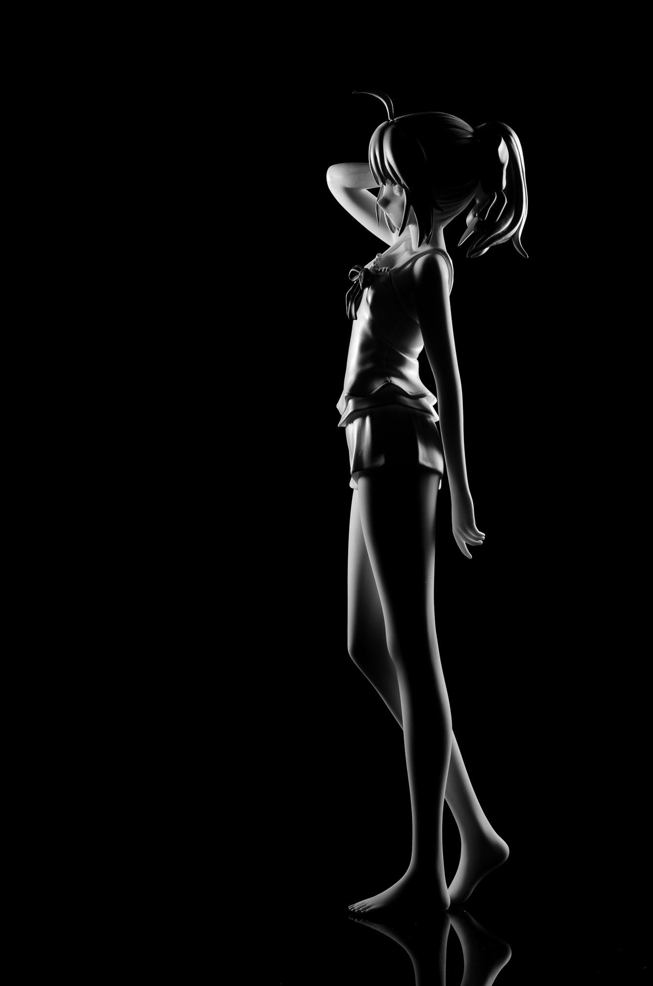
Of all the figures I re-shot since their original reviews, Alter’s summer Saber was among the most difficult. While the original review had some of my favourite photos to this day, the fact that I ran out of ideas for the indoors studio shows was plain as day. In retrospect, despite all the praise I heaped onto this figure, it really didn’t have that much going on by itself. It did not have great detail to admire up close, nor does it fill up the frame in an interesting way. So without fancy rivers and flowers, I struggled with making an interesting shot with it.
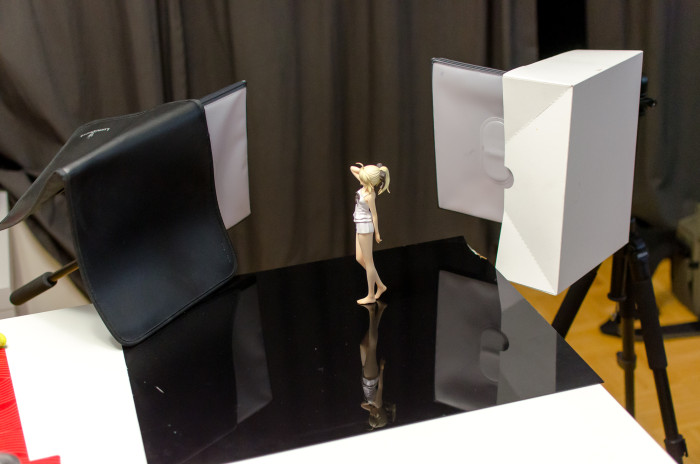
However, more recent experimentations with rim lighting got me thinking about ways to apply the technique more meaningfully. Rim lighting outlines the shape of the subject, and Saber has a very elegant and slim profile, making it the perfect candidate. The figure was lit from the back and to both sides, and the figure’s shape makes it easy to light relatively evenly. One source of frustration is that some of the light from the flashes would find its way into the lens, but this was circumvented by blocking off parts of the softbox.
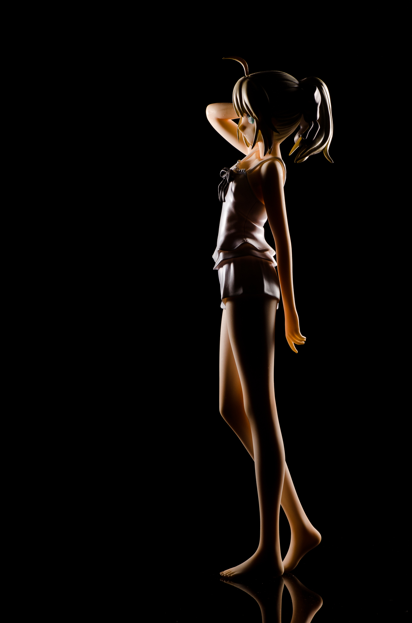
Incidentally, this is what the shot looks like in colour. Which version looks better? I might be going through some sort of a b&w phase and I need to make sure it hasn’t developed into an insane obsession.
4 replies on “Rim-Lit Saber”
I had been thinking about asking you how you were doing these rim lighting pictures, I guess now I know!
I think both versions of the picture look good. It’s not like you can’t just use Lightroom sorcery to make however many versions of a picture you want.
BUT THERE CAN ONLY BE ONE TRUE VERSION
I agree, both look good. But I lean more on the b&w one myself. The colour one makes her eye look weird, which in retrospect also ruins the b&w one somewhat because it was something I otherwise didn’t notice until I saw the green of her eyes.
Yeah, it’one of the reasons why I switched to b/w in the first place. This isn’t the first time that a figure’s eye reflected light in an undesirable way, and I figured going b/w might make the problem less distracting. I supposed it almost worked!